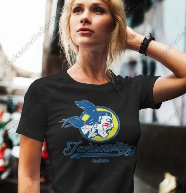
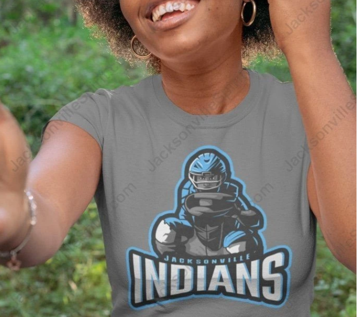
 T-shirts are great. They are easy to wear, comfortable, elegant and colorful, and you can get any slogan printed on them to show your motto. Therefore, a t-shirt is best to support your local sports teams. However, it’s not impossible to look trendy and stylish in t-shirts while supporting your favorite team. Here are a few tips.
1. Sizing
Although a t-shirt is a casual wear that you have to just slip in and move on, you can’t just pick any tee of any size. If you want to look stylish while supporting your team, you should especially give attention to sizing. Picking a standard-size t-shirt doesn’t really make sense.
Remember that size should be chosen depending on the nature of the design and your range of size.
Your design may look much bigger than it actually is depending on its shape. For example, circular or square shapes look better in a smaller size than standard.
It’s a good idea to print out your design at home on regular paper and place it on your t-shirt to check how it will look.
You should also think on whether one size fits all. Based on the size of your outfits, you may need to consider a reduced size print for smaller items.
You don’t need to think that your favorite team’s logo printed in a bigger size will be prominent and people will notice it. You should think ‘how’ it will look on your t-shirt. It should look good and people will automatically notice it.
2. Position of Design
Your design may often be conflated i.e. logo and slogan etc. It’s important to position it in the right location.
Your design may be so amazing to the extent of turning heads. But if its position is wrong, the heads will turn to you for a wrong reason. A commonly chosen wrong position is the belly print. It’s never pleasing.
One option is to choose a standard print position such as full front or full back. But you may also choose an alternate position, but it should be correct. A correctly chosen print position will set your design apart and promote your team more effectively.
3. Typography and Font
Typography of your message should be visually attractive on your t-shirt. It’s not the text itself; but whenever a text is displayed or printed, it includes typography to some extent.
Regarding design, typography is the art of typesetting i.e. arranging the type in such a way that it will make sense, together with choosing fonts, that ensures that lines and letters are correctly spaced, and interact with the graphic elements in an aesthetically pleasing way.
For example, if your message is printed in all caps in a single font, it won’t be so visually appealing; but if you choose different fonts and a mix of caps and small letters, it will bring a variety to the message and will look visually much more appealing.
Your choice of font can decide to a large extent how the design on your t-shirt is accepted, and convey the message about your team, and evoke emotions.
There are also some fonts that will go with just about anything, whereas other fonts will look good for only specific uses in particular contexts. If the name of the font you’ve chosen starts with “A” or “B”, it shows that you’ve not spent a lot of time choosing your font. Instead of doing this, explore more options.
While choosing different fonts, you should remember not to choose more than three fonts for your design.
4. Contrast
Contrast is very important to make your design stand out. The definition of contrast is the degree of visual difference between the darker and brighter or lighter parts of an image.
Your design may have a lot to do with your overall contrast, as long as the content and what colors are the most dominant.
Wear a t-shirt with a design using these tips and you can make your team hit in your town.


